5 Awesome Automotive Web Design Banners | Web Shop Managers
Effective automotive web design often goes hand in hand with online banner ads. We aren’t talking about paid ads you see on Google – we are talking about call to action banners within your automotive eCommerce site that entice users to click through your site to your specials and featured products. Pictures speak a thousand words, and if you have an attention grabbing banner it can be incredibly effective in pulling in potential customers and ultimately making a sale.
Why is automotive web design important?
Many people often wonder why the best automotive eCommerce sites need to be professionally designed if they are just selling car parts. One of the biggest benefits of having a designed site is that it shows you care about your business and want to give off a professional appearance. Your online store should be thought of in the same way as a brick & mortar location. You wouldn’t want your store looking old and run down would you? To have a professionally designed site is paramount to online success and customer trust. In today’s day and age, technology is evolving so quickly that any site that is not mobile responsive, looks outdated, or cannot load quickly will be left in the dust and your customers will go elsewhere.
Having eye-catching banners is a great way to improve your sites click through rate and guide your customers towards what page you want them to go to. Visual cues are what people most often respond to since the human brain can process images quicker than words. If you have a great banner or design, your site will outperform the competition.
Example 1: Mayfield's Performance

This is a great example of a online banner ad to draw customers towards programmer chips. Since programmer chips are not exciting on their own, the use of a modded truck with smoking tires really drives the point home that this chip will increase your vehicle's performance.
Example 2: Bomb Shelter Diesel
The explosion in the background with a high res image of a turbo charger really stands out and draws the eye towards the banner.
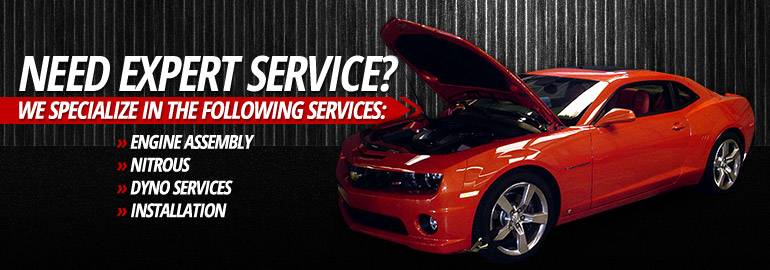
Example 3: RPM Motorsports

A simple an effective banner ad - this focuses on text and specializations with the image of a car with its hood up so users will associate the banner with under the hood help and maintenance.
Example 4: Tri State Line-X

Taking the patriotic approach is often highly effective as America is a country of cars and trucks, and no one takes more pride in their vehicles than us.
Example 5: American Speed & Custom

This banner uses an image of an AirAid intake system, showing how it works and the airflow's amazing power. This highlights the product's filtering ability and makes for an awesome banner.

BEDSLIDE - Client Testimonial
"The best thing out of everything was that our sales went up. The new site had a better design, the checkout process was better, and ultimately achieved all of our goals. That site has been up for a year and a half and we’re very happy with it, it’s still awesome." - Jake Plappert